“It’s time to pull the trigger.”
After months on end of negotiations, lining up resources and priorities, we were finally at the point where we needed to rebuild the entire system.
“Inside-out, it’s time for a new era.”
As the Product/UX team of the company, we were tasked to lead the project with an end-to-end delivery, from idea to product.
Even though it was one of the toughest challenges that we’ve ever confronted, we were still able to achieve something amazing at the end:
- Requirements for 5 different interfaces (iOS x1, Android x1, Web x 3, and API x 1)
- Established an effective product development process
- Established an internal knowledge library
- Vastly improved the quality of communication between teams
- Vastly reduced on-boarding time
- Eliminated bugs and errors rooted from flawed system design
As such, we would like to share what we did, and what we’ve learned throughout the journey of building the fourteen documentations for our new scalable product.
One thing worth mentioning is that our team considers these artifacts/documentations as the most fundamental cornerstone of what any company’s knowledge library should have, allowing them to grow with speed and accuracy.
List of product documentation templates
- Brand foundation (Brand guideline + Brand information)
- User persona (toC and toB, breaking into toB-buyer and toB-user)
- Industry knowledge & Glossary
- Design system
- Mock up
- Company roadmap
- Product backlog
- Interactive prototype
- Business requirements
- Functional requirements
- Cloud infrastructure documentation
- Micro-services architecture
- API documentation
- Data library
If you want to learn more about the tools, references and applications that helped us with our project, don’t worry we got you covered. We’ve included links at the end of this writing.
What about the project
Back in 2014, BloomMe was founded by a passionate serial entrepreneur Iella Koblenz with a mission to make running a beauty business simple, by offering spas and salons a one-stop resource management system.
What separates the business from other competitors is that we also offer consumers a one-stop booking experience through a mobile application that drives purchases from online to offline.

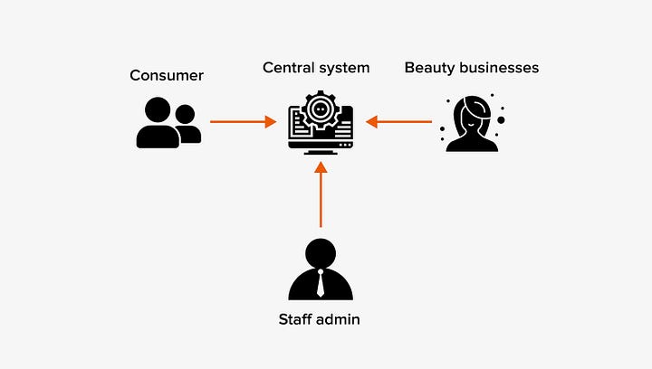
Simply put, we are the middleman between the merchants and the consumers, a typical B2B2C business model with O2O customer journey in the mix.
Even though this business model isn’t as complicated as putting a car onto the moon, the inherited problem of being a middleman, and bootstrapping as a startup without any frameworks further raises the difficulty of rebuilding the entire system.
Challenges we faced
Every company has its own challenges, BloomMe as a bootstrap startup fighter was no exception. When we started the project, we thought it’s also a great opportunity to fix some of the problems as well. Such as:
- Communication quality — teams spending more time finding information rather than focusing on delivery. Information and knowledge discrepancy between team members means they rely heavily on team lead for updates
- Effective decisions — lack of useful insights and readily available information makes it extremely difficult to make effective decisions efficiently
- Insight/knowledge preservation — non-consolidated information is not knowledge, it’s just noise. Also struggles with the constant loss of human capital in the form of knowledge after turnovers due to lack of documentation effort and refined system
- Bootstrapped legacy system w/o documentation — an inherited legacy system with no documentation, rely heavily on memory recollections and comments on task tickets, prioritizing short term speed over long term scalability
Framing the problem
Speaking from experience, the reason why most startups failed to scale is not because of the lack of adventurous investors who are waiting to invest, but rather to find the right focus that is helpful to their customer which brings real impact.
Money = depth of impact x urgency x width of scale
Especially when we are in the era of no-code interactive prototyping tools, we no longer need to wait for a year to build something, it’s all about early validations.
“If I had an hour to solve a problem, I’d spend 55 minutes thinking about the problem and 5 minutes thinking about the solutions.” — Albert Einstein

Among design/UX/discovery frameworks, the design discovery matrix by Dan Brown from his book Practical design discovery was most fitting for our project. It is highly recommended to those who want to refine their UX discovery process.
Reason being the matrix gives us a sense of progression when checking the items off the list. Also, it gives us a solid guideline to organize the information we collected into refined knowledge.
Research
Try imagining yourself as a young kid, stranded between the endless complaints about being a terrible partner, either being insensitive or failing to solve any real problems.
This is the reality of B2B2C.
The tricky thing about this is that the middleman needs to find a middle ground that keeps both sides happy. Not to mention, the needs, wants and pains between different user personas among the B2B market (users vs buyers vs executioners) further complicates the matter.
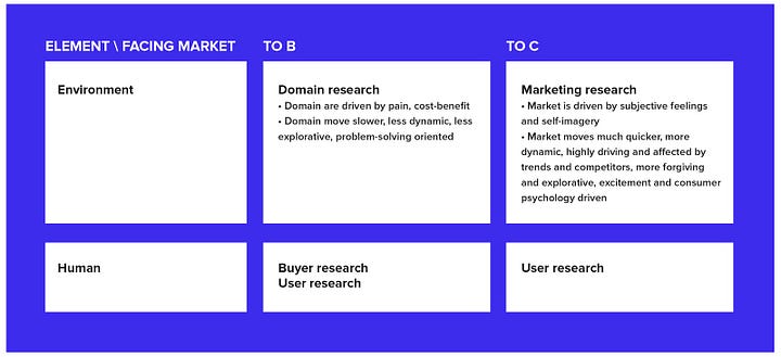
To avoid any drift of context when we were conducting our research, we broke the research down into a two-by-two matrix, clearly defining our team’s focus before we conduct our research. Not only does this set the perspective for our research, it also helps our team to empathize better with our interviewees.

Here’s what we’ve learned about the unique characteristic of each market from our researches.
B2B
- Problem-solving oriented: Businesses are highly driven by applicable problems, and customers consider trade-offs between cost-benefit religiously.
- Longer change cycle: changes can easily cause a butterfly effect because most businesses don’t just operate as a stand-alone. Upstream and downstream are always in consideration.
- Risk-averse: Less exploration in general, changes are not welcome.
B2C
- Excitement driven: Consumers celebrate personalization while welcomes pleasant surprises, always on the lookout for new excitement that acts like an escape from daily boredom.
- Self-reflection related: Especially the beauty industry, there is a high chance that the desire of the customer roots from personal value.
- Short change cycle: products have a shorter life span, the majority of demands are driven by trends and exposures.
- Adventurous: Consumers are more forgetful and forgiving than businesses, trust are less harder to earn due to less is on the stake.
Domain research
Qualitative research such as one-on-one visits are awesome when understanding a certain topic/subject, and quantitative research is best at validating hypotheses.


After spending hours interviewing different merchants, all this information were being organized to form the following artifacts:
- Knowledge library
- Glossary
- User journey & persona
- Data library for database scheme definitions
- Entity-relationship diagram
- Database scheme
This not only allows other teams to get a better understanding on the topic in order to make better decisions, it acts as the single source of truth when conflict or confusion arises.
Marketing research

When time is of the essence, and you are confident with what you already know, sometimes it’s alright to just either quantitative or qualitative research.
In our case, since our customer-facing application had been operating for a few years, and enough qualitative feedback was stacked up, we felt the confidence to only rely on our tracking data for the project.
We retrieved data directly from our tracking stacks and consolidated it into analytical insights. At this point, quantitative data are far more helpful than qualitative data at validating our design hypotheses.
Audit
We all felt the urge to scrap it and start fresh by coming up with new shiny ideas, because it will be difficult to decipher the “puzzle” that we’ve inherited from previous teams. However, the longevity of the system proved that something was right about it, that we should not simply ignore it.
Successful products usually have one thing in common, where they found the balance between the golden triangle of delivering a great product: value-add, user experience, and execution. As such, we took a look at what was being built.
- Business audit — understand where the business is standing, and to find room for improvement
- Design audit — understand how to be more effective at delivering our value to customer using design, and how to scale efficiently by using design systems
- Technical audit — understand where is the limitation, and how to improve the system’s effectiveness and efficiency


Finally…
Even though the development was terminated because the business ceased operation under the impact of COVID-19, nevertheless the work itself was still worth the celebration.
Here’s something we’ve learned along the journey, and we hope that the lesson we learned will help you to build helpful products.
- Identify your deliverable first — work your way backward to avoid scope creep
- Transparency is king — most conflicts come from poor communication, and keeping everyone on the same page makes things a lot easier
- Collect, consolidate and stay organized — Unorganized information are useless, and organized knowledge makes helpful insights
- Listen, don’t shoot first — Always start from listening to your customer, and make no assumptions
- It’s ok to say no — you can’t win all battles, pick those that are worth fighting and stick it out
Who made this happen?
The project would’ve been a disaster without a strong team: a team filled with talented people with great dynamics where we complement each other while having fun.
- Mandy Chan (Lead UX/UI designer) — LinkedIn
- Mandy Tam (UX/UI designer, researcher) — LinkedIn
- Jasmine Xie (UX/UI designer, researcher) — LinkedIn, Portfolio
- Ivan Oung (Project team lead) — LinkedIn
Special thanks to Michael Tsang (our CS lead) for the interview meeting arrangements. His great personal relationships with our merchants made the research happen.
References
A list of readings and references for your information.
Reading materials
- B2B vs B2C by Hubspot
- Mind mapping how and why by Lucidchart
- Research discovery framework by Dan Brown
Data analysis and tracking
Design, graphs and prototyping
- Draw.io — From drawing use case flow diagrams to cloud system architecture
- Figma — For designing interfaces and prototyping
Templates
- Business value preposition by Strategyzer — Find out how your business creates value for customers
- Customer interview report by Confluence — A template to consolidate research findings after customer interviews
- Business & technical requirement documentation by Aha — What is a good product requirements document template?